The Reserve Bank of Australia provides a monthly snapshot of the world and Australian economies through its Chart Pack. As I've argued before there really is no better source of graphical insight into the Australian economy. Unfortunately, they won't release the raw data for some of the graphs because some of the data is subject to copyright.

This first one shows the recent downturn in world growth and why Australia has done relatively better than the rest of the world. Compared to the world as a whole, Australia's trading partners have recovered more rapidly, with China and India (and the rest of Asia) doing far better than the Europe (with the exception of Germany) and North America. But it also shows just how severe the drop in growth was at the bottom of the recession and how government action made such a big difference. Paying off some of that govt action, however, will make a difference to GDP growth with the UK's recent economic contraction an indicator of possibilities elsewhere of retrenchment. The US of course has eschewed such hairshirt policies and the graphs below on unemployment and inflation in the US provide some indication as to why this is the case.

This second graph shows just how severe the recession was in Japan, the United States and Euro area. The contraction was most severe in Japan, but it has recovered better.
Compare this to the Chinese and Indian experiences of the global recession. Note there was no slip into negative territory although some commentators argue that anything below 5-6 per cent growth in China might feel like a recession!! For an interesting take on Chinese GDP figures, have a read of Michael Pettis's recent blog piece.

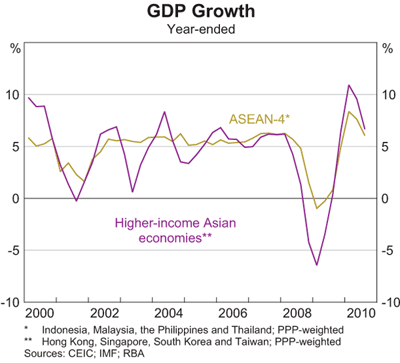
The rest of Asia did not do quite so well, but it shows why many commentators are arguing that Asia had a good global recession and why many people now think the 21st century will be dominated by Asia.
There is also a big debate going on about inflation pressures and many worry that monetary authorities (especially in the US and Europe) are not taking them seriously enough. Many of these same commentators don't seem to be too concerned about unemployment partly because they get extremely worried when labour markets tighten up (as they are in Australia). But the next two graphs show that at the moment unemployment should be the major concern of policy-makers in the US and Europe. Inflation obviously isn't the problem in Japan! Japan's issue is deflation. But falling prices might not be the good thing that your grandma might imagine. Just imagine her saying "things used to be so much cheaper when I was young". To crudely understand why this is a problem, think about why you would buy something today when it will be cheaper tomorrow.


The graph on unemployment should make us realise just how good a global recession we've had in Australia compared to the United States. With the amount of building work to be done to deal with natural disasters, it's unlikely that aggregate unemployment is going to be a major concern in Australia. No doubt, however, there are more concerns when we disaggregate the labour market and start to think about skills development and training etc.
Inflation, however, is a problem for China and India and efforts to deal with it could have an impact on Australia.

The next graphs shows the impact of Chinese government efforts to bolster the economy during the downturn. The year-ended growth figures are truly astounding as was the growth in credit. Although credit growth has declined, note what it has declined to!! It 'only' grew by around 20 per cent during 2010!


What does all this mean? Well for one thing how the Chinese government handles inflation and the growth in the Chinese property market are going to have large implications not only for Australia, but for the rest of Asia and, indeed, the whole world.


This second graph shows just how severe the recession was in Japan, the United States and Euro area. The contraction was most severe in Japan, but it has recovered better.
Compare this to the Chinese and Indian experiences of the global recession. Note there was no slip into negative territory although some commentators argue that anything below 5-6 per cent growth in China might feel like a recession!! For an interesting take on Chinese GDP figures, have a read of Michael Pettis's recent blog piece.

The rest of Asia did not do quite so well, but it shows why many commentators are arguing that Asia had a good global recession and why many people now think the 21st century will be dominated by Asia.

There is also a big debate going on about inflation pressures and many worry that monetary authorities (especially in the US and Europe) are not taking them seriously enough. Many of these same commentators don't seem to be too concerned about unemployment partly because they get extremely worried when labour markets tighten up (as they are in Australia). But the next two graphs show that at the moment unemployment should be the major concern of policy-makers in the US and Europe. Inflation obviously isn't the problem in Japan! Japan's issue is deflation. But falling prices might not be the good thing that your grandma might imagine. Just imagine her saying "things used to be so much cheaper when I was young". To crudely understand why this is a problem, think about why you would buy something today when it will be cheaper tomorrow.


The graph on unemployment should make us realise just how good a global recession we've had in Australia compared to the United States. With the amount of building work to be done to deal with natural disasters, it's unlikely that aggregate unemployment is going to be a major concern in Australia. No doubt, however, there are more concerns when we disaggregate the labour market and start to think about skills development and training etc.
Inflation, however, is a problem for China and India and efforts to deal with it could have an impact on Australia.

The next graphs shows the impact of Chinese government efforts to bolster the economy during the downturn. The year-ended growth figures are truly astounding as was the growth in credit. Although credit growth has declined, note what it has declined to!! It 'only' grew by around 20 per cent during 2010!


No comments:
Post a Comment
Please be civil ...