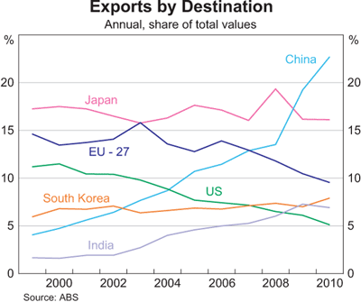
Australia's trade performance has been marked by a shift back towards resources since the early 2000s, with a remarkable shift in trade towards China over the past 10 years from under 5% to about 27% today.
This bonanza is reflected in Australia's terms of trade.

The terms of trade is an index-measure ratio of the average price level of exports to the average price level of imports. It effectively reflects the capacity of a given quantity of exports to pay for a given quantity of imports, and provides an important indication of the strengths and weaknesses of the economic structure. A rising or falling terms of trade indicates the possibility of improving or declining living standards, because if what we sell earns relatively more than what we buy, we will be relatively wealthier. Because the terms of trade is a ratio, increases can be a result of export prices increasing at a greater rate than import prices, or export prices increasing while import prices are declining, or export prices declining at a slower rate than import prices. Of course, a rising terms of trade doesn’t stop us from buying more things than we sell, which we have made a habit of for much of our history! Improvements in the terms of trade are not reflected in GDP figures, but improvements do contribute significantly to increases in national disposable income.
Most commentators now think that the terms of trade has peaked and this appears more clearly in commodity prices. The terms of trade has provided a big income boost to Australia, which is not directly measured in GDP growth figures, but obviously higher income eventually has an impact on growth. Alongside the paying off of debt and the end to the effective increase in real income that comes from a higher exchange rate and lower import prices, these factors makes for a less favourable outlook for Australians over the coming year.

Note the rapid ascent of China as a share of the total and the less dramatic, but still significant growth of India's share. Compare this to the decline of the EU and US shares.

The increase in the volume of bulk commodity exports is a major factor, although the major influence on income has been the increase in prices rather than the increase in volumes.


One of the consequences of the resources boom has been an amazing growth in the level of mining investment. Given that Australia's mining sector is 80 per cent foreign owned (according to the RBA), much of this investment comes from overseas and much of the profit (eventually) also goes overseas. This negative impact on the current account deficit is offset by the positive impact of increased resource exports.
Remember that the current account can be a CAS i.e. a current account surplus. For the world as a whole deficits and surpluses must match unless we start trading with another planet. See here for further explanation.

The other way of viewing the CAD is to see it as the difference between saving and investment. This is the way most economists, especially Treasury and the RBA prefer to view the CAD because it is an accounting identity. Now obviously the two formulae can be reconciled, but I won't bore you with the details here.
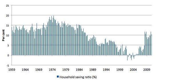
The CAD = Saving - investment approach is also preferred as an explanation because it correctly implies that Australia's CAD is driven by high investment in the mining sector, rather than low saving. Indeed Australian saving has returned to more normal levels since the GFC after a period of negative saving.
This is from the latest ABS quarterly accounts.

A longer term view is provided by Bill Mitchell, which shows that saving patterns are simply returning to earlier levels.
 Now if saving increases, this should mean that more Australian investment can be funded domestically, but we are currently going through the biggest mining investment boom in our history. (What is most interesting about this boom is that there is both a massive terms of trade boom and a massive investment boom at the same time).
The following graph from RBA Deputy Governor Philip Lowe shows just how big is that investment surge.

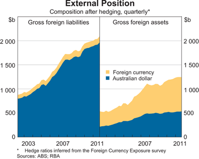
As a consequence it is not surprising that Australia's foreign financial liabilities remain high.

This bonanza is reflected in Australia's terms of trade.

The terms of trade is an index-measure ratio of the average price level of exports to the average price level of imports. It effectively reflects the capacity of a given quantity of exports to pay for a given quantity of imports, and provides an important indication of the strengths and weaknesses of the economic structure. A rising or falling terms of trade indicates the possibility of improving or declining living standards, because if what we sell earns relatively more than what we buy, we will be relatively wealthier. Because the terms of trade is a ratio, increases can be a result of export prices increasing at a greater rate than import prices, or export prices increasing while import prices are declining, or export prices declining at a slower rate than import prices. Of course, a rising terms of trade doesn’t stop us from buying more things than we sell, which we have made a habit of for much of our history! Improvements in the terms of trade are not reflected in GDP figures, but improvements do contribute significantly to increases in national disposable income.
Most commentators now think that the terms of trade has peaked and this appears more clearly in commodity prices. The terms of trade has provided a big income boost to Australia, which is not directly measured in GDP growth figures, but obviously higher income eventually has an impact on growth. Alongside the paying off of debt and the end to the effective increase in real income that comes from a higher exchange rate and lower import prices, these factors makes for a less favourable outlook for Australians over the coming year.

Note the rapid ascent of China as a share of the total and the less dramatic, but still significant growth of India's share. Compare this to the decline of the EU and US shares.
The increase in the volume of bulk commodity exports is a major factor, although the major influence on income has been the increase in prices rather than the increase in volumes.


One of the consequences of the resources boom has been an amazing growth in the level of mining investment. Given that Australia's mining sector is 80 per cent foreign owned (according to the RBA), much of this investment comes from overseas and much of the profit (eventually) also goes overseas. This negative impact on the current account deficit is offset by the positive impact of increased resource exports.
Remember that current account deficits (CADs) can be viewed in two ways (see here for explanation). While both are correct, how commentators measure them is sometimes indicative of ideological proclivities or agendas. For those worried that Australia doesn't generally export enough to cover its imports, the current account deficit is seen as the trade deficit plus the income deficit, which measures the balance of interest and dividend payments away from Australia. The mining sector is a case in point. Given that it is 80 per cent foreign owned a good deal of profits (dividends) flow out of the country. Also give that Australia has a huge foreign (private) debt, a lot of interest payments must be made to foreigners. In this interpretation of the CAD, the solution is to increase exports and cut foreign borrowing. The formula for this version is:
CA = X - M + NY + NCT
X = Exports of goods and services
M = Imports of goods and services
NY = Net income abroad
NCT = Net current transfers
Remember that the current account can be a CAS i.e. a current account surplus. For the world as a whole deficits and surpluses must match unless we start trading with another planet. See here for further explanation.

The other way of viewing the CAD is to see it as the difference between saving and investment. This is the way most economists, especially Treasury and the RBA prefer to view the CAD because it is an accounting identity. Now obviously the two formulae can be reconciled, but I won't bore you with the details here.
The CAD = Saving - investment approach is also preferred as an explanation because it correctly implies that Australia's CAD is driven by high investment in the mining sector, rather than low saving. Indeed Australian saving has returned to more normal levels since the GFC after a period of negative saving.
This is from the latest ABS quarterly accounts.

A longer term view is provided by Bill Mitchell, which shows that saving patterns are simply returning to earlier levels.
The following graph from RBA Deputy Governor Philip Lowe shows just how big is that investment surge.

As a consequence it is not surprising that Australia's foreign financial liabilities remain high.


No comments:
Post a Comment
Please be civil ...