If you're ever looking for up-to-date graphs on the world and Australian economies, the Reserve Bank of Australia's Chart Pack is a great place to start.
For the world economy as a whole it is clear that growth has slowed over recent times. This is clearly the case for the advanced economies, but is also true for China, India and the rest of Asia.

The graph shows just how significant was the decline in growth in 2008. That rapid recovery there had a lot to do with government spending throughout the world. Increasingly it looks clear that governments throughout the developed world, but especially in Europe may have tightened fiscal policy too quickly leading to lower growth and ironically an inability to pay off debt through the increased tax receipts available when growth is higher. Britain and Ireland are great reminders of the wisdom supposedly learnt in the Great Depression: cutting spending during a recession leads to ... continuing recession! Ta da.
Japan's miserable growth performance continues.

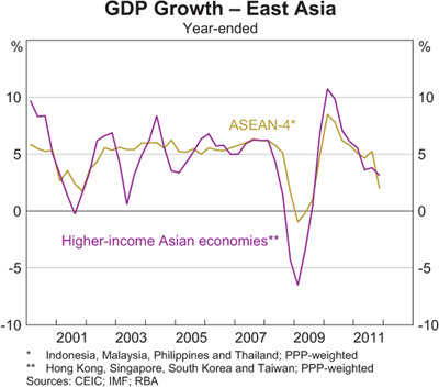
High growth in East Asia has also decelerated.

As have the miracle economies of China and India.

Australia continues to do well considering the world economy.

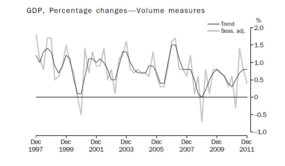
The latest figures from the ABS show that growth in Australia in the December Quarter was slower than expected at 0.4 per cent.
Growth in Australia over 2011 was 2.3 per cent, which is below trend.

All of those seasonally adjusted downturns went for one quarter only, which means they don't signify a recession.
In terms of contributions to growth, it seems surprising that manufacturing contributed more than mining in 2011!

The manufacturing sector's employment performance was not so good.

One of the consequences of austerity in Europe is higher unemployment. Sustained high employment is never a good thing in countries with strident Nationalist political parties.

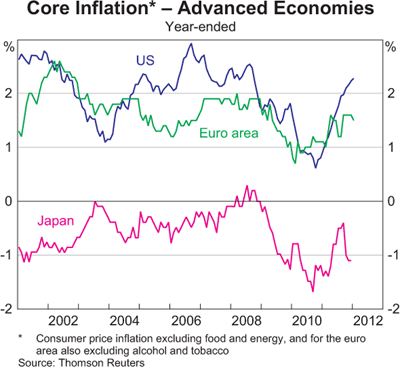
One bright spot for macroeconomic policy is subdued inflation. Some commentators were warning that inflation was in danger of getting out of control in early 2011. This view now appears to be overly hawkish.

Even worrying trends for higher inflation in China and India have reversed.

Inflation in Australia also remains subdued and is on the way down.


As Gregory and Sheehan point out many of the price increases over 2011 occurred in just a few categories:
China's fiscal and monetary stimulus has clearly come to an end.

 What happens to that red line over the coming year will be significant for Australian exports of coal and iron ore.
Next post we'll consider Australian finance and trade.
For the world economy as a whole it is clear that growth has slowed over recent times. This is clearly the case for the advanced economies, but is also true for China, India and the rest of Asia.

The graph shows just how significant was the decline in growth in 2008. That rapid recovery there had a lot to do with government spending throughout the world. Increasingly it looks clear that governments throughout the developed world, but especially in Europe may have tightened fiscal policy too quickly leading to lower growth and ironically an inability to pay off debt through the increased tax receipts available when growth is higher. Britain and Ireland are great reminders of the wisdom supposedly learnt in the Great Depression: cutting spending during a recession leads to ... continuing recession! Ta da.
Japan's miserable growth performance continues.

High growth in East Asia has also decelerated.
As have the miracle economies of China and India.

Australia continues to do well considering the world economy.

The latest figures from the ABS show that growth in Australia in the December Quarter was slower than expected at 0.4 per cent.
Growth in Australia over 2011 was 2.3 per cent, which is below trend.
All of those seasonally adjusted downturns went for one quarter only, which means they don't signify a recession.
In terms of contributions to growth, it seems surprising that manufacturing contributed more than mining in 2011!

The manufacturing sector's employment performance was not so good.

One of the consequences of austerity in Europe is higher unemployment. Sustained high employment is never a good thing in countries with strident Nationalist political parties.

One bright spot for macroeconomic policy is subdued inflation. Some commentators were warning that inflation was in danger of getting out of control in early 2011. This view now appears to be overly hawkish.
Even worrying trends for higher inflation in China and India have reversed.

Inflation in Australia also remains subdued and is on the way down.


As Gregory and Sheehan point out many of the price increases over 2011 occurred in just a few categories:
Bad luck for those who like lamb chops and three veg and some fruit for dessert (standard evening fair in my family in the 80s.Over the three years to the June quarter of 2011 five sub‐groups, out of a total of 90 in the CPI and accounting for about 12% of the index, have provided 40% of the growth in the CPI, and 44% of the growth over the past year. The five groups are lamb and mutton, fruit, vegetables, utilities and tobacco. These five groups in total have risen by 11.9% per annum over the past three years, while the rest of the CPI rose by 1.8%; over the past year the five groups rose by 16.7% and the rest of the index by 2.2%.
China's fiscal and monetary stimulus has clearly come to an end.


Next post we'll consider Australian finance and trade.
No comments:
Post a Comment
Please be civil ...