Tuesday, March 31, 2015

Military Spending: Australia Compared

Military spending has been in decline in many countries throughout the world and Australia is no exception as the charts below show. 


Source: World Bank

There are several ways to consider and compare global military spending. One way is to consider the level of spending as a percentage of a country's GDP. Comparing military spending as a percentage of GDP allows us to consider how much of economic growth is taken up with military expenditures.

While the United States has the world's largest military by far it ranks only 13th on the level of spending as a percentage of GDP. (see tables at the bottom for rankings)

Australia's military spending as a percentage of GDP is below the world average and is now below the average for East Asia and the Pacific. We still spend proportionally more than Indonesia, although if the Indonesian economy becomes considerably larger than the Australian economy over coming years, as many commentators believe is likely, then its total spend will also be considerably larger than Australia's. 


Australia also spends less than comparably wealthy countries represented by the OECD.


RankCountry           2013
1Oman11.48
2Saudi Arabia8.99
3Afghanistan6.24
4Israel5.63
5Angola5.01
6Algeria4.95
7Azerbaijan4.68
8Lebanon4.36
9Russian Federation4.19
10Armenia4.10
11Yemen, Rep.3.93
12Morocco3.90
13United States3.81
14Bahrain3.77
15Jordan3.56
16Mauritania3.56
17Iraq3.54
18Colombia3.44
19Pakistan3.39
20Singapore3.27
21Kyrgyz Republic3.24
22Namibia3.15
23Ecuador3.11
24Swaziland2.96
25Ukraine2.93
26Zimbabwe2.78
27Georgia2.74
28Sri Lanka2.71
29Korea, Rep.2.60
30Brunei Darussalam2.56
31Greece2.46
32India2.45
33Turkey2.33
34United Kingdom2.30
35France2.24
36Burundi2.24
37Vietnam2.18
38Portugal2.17
39Serbia2.17
40Uganda2.16
41Lesotho2.15
42China2.05
43Botswana2.02
44Tunisia2.01
45Chile1.96
46Estonia1.96
47Kenya1.95
48Uruguay1.87
49Timor-Leste1.81
50Poland1.79
51Zambia1.69
52Egypt, Arab Rep.1.67
53Croatia1.66
54Australia1.63
55Cambodia1.60
56Paraguay1.60
57Bulgaria1.58
58Italy1.58
59Montenegro1.57
60Malaysia1.55
61Thailand1.52
62Bolivia1.45
63Nepal1.43
64Peru1.42
65Norway1.41
66Burkina Faso1.41
67Mali1.41
68Brazil1.40
69Congo, Dem. Rep.1.40
70Denmark1.38
71Bangladesh1.37
72Malawi1.36
73Belarus1.35
74Fiji1.34
75Germany1.34
76Cameroon1.34
77Romania1.33
78Gabon1.32
79Albania1.30
80Netherlands1.29
81Philippines1.28
82Finland1.27
83Kazakhstan1.25
84Honduras1.24
85Macedonia, FYR1.24
86Venezuela, RB1.21
87South Africa1.17
88Sweden1.17
89Tanzania1.15
90Bosnia and Herzegovina1.13
91Rwanda1.11
92El Salvador1.10
93Czech Republic1.08
94Guyana1.07
95Belize1.04
96Belgium1.04
97Benin1.04
98Seychelles1.03
99Canada1.01
100New Zealand1.00
101Japan0.99
102Spain0.94
103Indonesia0.90
104Jamaica0.85
105Ethiopia0.82
106Switzerland0.78
107Austria0.78
108Nicaragua0.76
109Liberia0.75
110Argentina0.74
111Mexico0.62
112Dominican Republic0.61
113Papua New Guinea0.57
114Ireland0.55
115Ghana0.53
116Madagascar0.51
117Luxembourg0.51
118Cabo Verde0.50
119Guatemala0.48
120Nigeria0.47


US military spending has declined over recent years, whilst China's has increased. Since 2004 Chinese military spending has increased by 170 per cent, whilst its GDP Has increased by 140 per cent. Still China only spends 2.05 per cent of its GDP while the US spends 3.81 per cent. Japan, due to its pacifist constitution still spends just under 1 per cent.

The table below constructed from SIPRI databases shows basic measure alluded to above of total military spending converted to US Dollars. It shows the top 60 military spenders in the world (New Zealand comes in at 60). 

Figures are in US$m. at 2013 prices and exchange rates.


RankCountry 2013 
1USA                           640221
2China, P. R.                  188460
3Russia87836
4Saudi Arabia                  66996
5France                        61228
6UK                            57891
7Germany                       48790
8Japan                         48604
9India                         47398
10Korea, South                  33937
11Italy                         32657
12Brazil                        31456
13Australia                     23963
14Turkey                        19085
15Canada                        18460
16Israel                        16032
17Colombia                      13003
18Spain                         12765
19Taiwan                        10530
20Algeria                       10402
21Netherlands                   10328
22Singapore                     9759
23Poland                        9257
24Oman                          9246
25Iraq                          7896
26Indonesia                     7840
27Mexico                        7838
28Pakistan                      7641
29Norway                        7235
30Sweden                        6519
31Angola                        6095
32Greece                        5939
33Thailand                      5891
34Kuwait                        5815
35Chile                         5435
36Ukraine                       5338
37Venezuela                     5313
38Belgium                       5264
39Switzerland                   5053
40Malaysia                      4842
41Portugal                      4784
42Denmark                       4553
43Argentina                     4511
44Egypt                         4255
45South Africa                  4108
46Morocco                       4064
47Philippines                   3472
48Azerbaijan                    3440
49Viet Nam                      3387
50Finland                       3262
51Austria                       3230
52Peru                          2865
53Ecuador                       2803
54Kazakhstan                    2799
55Romania                       2521
56Nigeria                       2411
57Myanmar                       2211
58Czech Rep.                    2149
59Lebanon                       1936
60New Zealand                   1833

Friday, March 27, 2015

Charts of the Week

The purple areas are spreading the arms wealth+


Note Australia not in the big league


High levels of household debt will eventually have to be reversed. The argument of the Reserve Bank is that because most of the debt is owned by richer households it will not be a problem going forward. I'm not so sure.


Housing dominates household debt, funnily enough. 


Investor housing has shifted into the purchase of existing properties. One day soon Australians will realise that buying and selling houses to each other and digging things out of the ground is not a sustainable model for a rich country. 


The growth of apartment building.


Foreign ownership of farmland. Why this is a more important issue than our 80 per cent foreign owned mining sector is beyond my reasoning capabilities. Farmland can be neglected or overused but it can't be taken out of the country. Mining commodities are exported and gone.


We don't seem particularly concerned about the Canadians buying farms and agricultural producers.


Rapid Chinese growth from a low base.


The growing importance of services in consumption, with education more than doubling its share


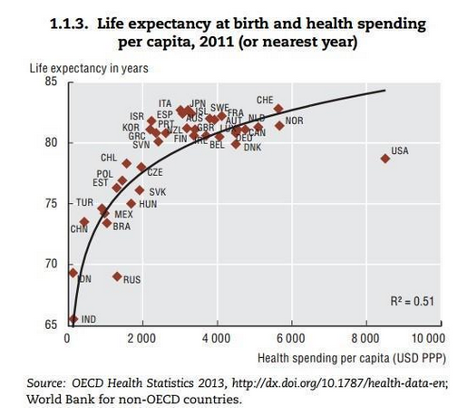
US as an outlier on health spending


 The breakdown of taxes levied by the Commonwealth in Australia.


Greeks work longest in Europe, apparently.


Coal use continues to expand in Asia, while oil continues its slide. Gas and renewables continue to gain ground.

Tuesday, March 24, 2015

Polling on Climate Change and Renewable Energy in Australia

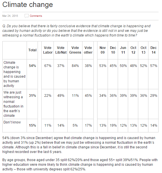
Essential recently polled Australians on climate change and renewable energy. The results were as follows. Given that NASA reports that "ninety-seven percent of climate scientists agree that climate-warming trends over the past century are very likely due to human activities, and most of the leading scientific organizations worldwide have issued public statements endorsing this position", the level of scepticism might be surprising.  But hell a lot of people believe things that make me puzzled.

It is not unexplainable then that 31 per cent of Australians think that: "We are just witnessing a normal fluctuation in the earth’s climate".  It is explainable because we have one of the most hostile governments to the environment in Australian history, encouraging scepticism about climate change.

Fifty-two per cent of Australians have become more concerned about climate change, but a majority think that incentives for renewables are the best solution. Only a third of respondents, however, thought that the renewable energy target should be increased.


Redistribution, Inequality, and Growth

An excellent paper by Johnathon D. Ostry, Andrew Berg and Charalambos G. Tsangarides (2014) “Redistribution, Inequality, and Growth’, International Monetary Fund Staff Discussion Note, Washington, DC. <https://www.imf.org/external/pubs/ft/sdn/2014/sdn1402.pdf> argues:
First, more unequal societies tend to redistribute more. Among OECD countries, more inequality tends to be associated on average roughly one-for-one with higher redistribution, such that there is almost no overall correlation between net and market inequality. While the effect is weaker in non-OECD countries, it is nevertheless still present. It is thus important to distinguish between market and net inequality in trying to understand the growth-inequality nexus and to separately control for redistribution in growth-inequality work. 
Second, lower net inequality seems to drive faster and more durable growth for a given level of redistribution. These results are highly supportive of our earlier work, now encompassing not only duration analysis but also the panel regression approach common in earlier literature, and also controlling for the net/market distinction. 
Third, redistribution appears generally benign in its impact on growth; only in extreme cases is there some evidence that it may have direct negative effects on growth. Thus the combined direct and indirect effects of redistribution—including the growth effects of the resulting lower inequality—are, on average, pro-growth. 
Against these results, it must be borne in mind that the data are particularly scarce and unreliable for redistribution, even more so than for inequality. Indeed, one possible interpretation of our results is that the data on redistribution simply do not contain enough information to infer a negative (or for that matter a positive) direct effect. We believe our results are nonetheless informative. We have used the best available data for the analysis of large numbers of countries over time. The analysis of spells inevitably requires the use of older and perhaps less comparable data, but the results for average growth hold even when the analysis is restricted to only the most reliable and recent data.
They conclude:
We have taken advantage of a new comprehensive data set to look at the relationship between inequality, redistribution, and growth; earlier work on the inequality-growth relationship has generally confounded the effects of redistribution and inequality. Our focus has been on the medium and long term, both growth over five-year periods and the duration of growth spells. 
Several important conclusions emerge. 
First, inequality continues to be a robust and powerful determinant both of the pace of medium-term growth and of the duration of growth spells, even controlling for the size of redistributive transfers. Thus, the conclusions from Berg and Ostry (2011) would seem to be robust, even strengthened. It would still be a mistake to focus on growth and let inequality take care of itself, not only because inequality may be ethically undesirable but also because the resulting growth may be low and unsustainable. 
And second, there is surprisingly little evidence for the growth-destroying effects of fiscal redistribution at a macroeconomic level. We do find some mixed evidence that very large redistributions may have direct negative effects on growth duration, such that the overall effect—including the positive effect on growth through lower inequality—may be roughly growth-neutral. But for non-extreme redistributions, there is no evidence of any adverse direct effect. The average redistribution, and the associated reduction in inequality, is thus associated with higher and more durable growth. We need to be mindful about over-interpreting these results, especially for policy purposes. It is hard to go from these sorts of correlations to firm statements about causality. We have not accounted for the possible effects that redistribution may have on market inequality. We have emphasized the uncertainty caused by the scarcity of reliable data, particularly about redistribution. Our measure of redistribution captures only direct taxes and subsidies, for example, so we shed no direct light on the redistributive effects of in-kind government provision of health and education which a priori would seem, if anything, to be more growth friendly than the measures we account for. 
Finally, we know from history and first principles that after some point redistribution will be destructive to growth, and that beyond some point extreme equality also cannot be conducive to growth. We nonetheless see an important positive conclusion from our look at the big picture. Extreme caution about redistribution—and thus inaction—is unlikely to be appropriate in many cases. On average, across countries and over time, the things that governments have typically done to redistribute do not seem to have led to bad growth outcomes, unless they were extreme. And the resulting narrowing of inequality helped support faster and more durable growth, apart from ethical, political, or broader social considerations. This leaves a large research and policy agenda. Even given these results about average effects, it remains important to try to make redistribution as efficient as possible. And further insight into the mechanisms at play would help sharpen our understanding and policy recommendations. Our results here highlight the urgency of this agenda.

Monday, March 23, 2015

The Global Imbalances: Janus-faced Adjustment

Global imbalances may have come down slightly since the lead up to the global crisis. but they still exist as the chart and table below make clear. China's surplus has come down but Germany's remains, which means continuing problems for southern Europe.

Resolution of the imbalances would help global growth, but it would require surplus countries to adjust as well.  Germany has benefitted from the Euro and repressed consumption, which led to a current account surplus and the export of capital to Southern Europe. This capital led to increased private debt in Spain and was used to inflate property prices.  But remember the problem has two sides - the capital exports and unproductive borrowing, leading to unbalanced current accounts. This means that the solution has two sides - adjustment by both Southern Europe and Germany.


China's recent import collapse means that it currently runs a $US60 billion surplus. The question is will the deficit countries continue to accept the huge surpluses of Germany and China or take measures to restrict imports.

There's a lot at stake in Europe right now and the Germans continue to moralise that Southern Europeans need to embrace further austerity. Germany needs to run a deficit not a surplus. Britain could also help out by abandoning austerity.


Property and House Price Indexes

House price rises in Australia exceed rises virtually anywhere in the world. Australia is due for a fall in prices, but the question is when. 

To get a better grasp on rises I've consulted the ABS 6416.0 - Residential Property Price Indexes: Eight Capital Cities, Dec 2014.  

Undoubtedly, Sydney price rises have been significant in recent times, but if you if you index property price rises to 2003, using ABS data Sydney under performs the weighted average and even Adelaide. Obviously there was a boom in prices in Sydney before 2003, but the starting point of an index can make a very big difference. I use 2003 because that is the beginning point of the ABS data. 


If, however, we shift the index starting point to March 2008 a different picture emerges. 


Shifting the index starting point to March 2013 gives us a  different picture again, showing clearly that most of the action has been in Sydney. 


Sunday, March 22, 2015

Household Debt: RBA says She'll Be Right

The RBA does not appear to be too worried about rising household indebtedness.  A new paper by Tom Bilston, Robert Johnson and Matthew Read, "Stress Testing the Australian Household Sector Using the HILDA Survey" contends that:
Higher levels of household indebtedness are an endogenous – and expected – response to permanently lower nominal interest rates. ... Additionally, higher household indebtedness can facilitate consumption smoothing, consistent with lifecycle ... or permanent-income ... hypotheses. Furthermore, to the extent that higher household indebtedness increases entrepreneurship and access to further education, it may raise living standards and long-run economic growth. Nevertheless, higher household indebtedness can also amplify the effects of economic and financial shocks on households. ... 
Despite the increase in aggregate household indebtedness over the 2000s, the distribution of household debt was little changed. The share of households with some debt rose slightly over the 2000s, to be around 70 per cent in 2010. Higher-income households (those in the top 40 per cent of the income distribution) owed around three-quarters of household debt (Table 1); these households generally have the lowest debt-to-income and debt-servicing ratios. Similarly, the most asset-rich 40 per cent of households owed around three-quarters of household debt. 
Households where the head was prime working age (35 to 54 years) owed about 60 per cent of household debt. However, the share of household debt owed by older households rose slightly over the decade. This probably reflected a decrease in the rate of property downsizing, increased life expectancies and a trend toward geared property investment. Even so, because older households tended to be among the wealthiest households, their increased indebtedness did not necessarily reflect a rise in the household sector’s overall financial vulnerability.


Household debt generally appears to have been well collateralised during the 2000s. The share of household debt secured by property rose slightly over the decade, to be nearly 90 per cent in 2010 (Table 2). About half of household debt was for the purchase of owner-occupier property (‘primary mortgages’). However, the rise in the share of household debt secured by housing was due to an increase in ‘other’ housing loans, such as second mortgages secured against owner-occupier property (e.g. home equity loans) and loans for the purchase of investment property. The value of credit card and other personal loans as a share of household debt both fell slightly over the decade.
The paper conducts a stress test of the household sector and finds that: The results suggest that the share of households whose incomes are estimated to be less than minimum expenses (i.e. with negative financial margins) fell from around 12 per cent in 2002 to 8 per cent in 2010. These households tend to have lower incomes, be younger and live in rental accommodation; however, these groups tend to hold a relatively low proportion of 30 total household debt. Households that were more indebted did not necessarily appear to be more likely to have negative financial margins than households that were less indebted. This could be interpreted as evidence that the screening lenders carry out in assessing loan applications is effective. 
Lenders’ exposure to households with negative financial margins appears to have remained limited, with expected loan losses (based on the assumptions underlying our model and in the absence of any adverse shocks) increasing over the 2000s, but remaining fairly low. This increase occurred despite the share of households with negative financial margins falling over this period, implying that these households owed an increasing share of debt and/or held less valuable collateral relative to this debt. The limited increase in expected loan losses is despite a substantial increase in aggregate household indebtedness, as well as the impact of the global financial crisis on the labour market and asset prices. This suggests that aggregate measures of household indebtedness may be a misleading indicator of the household sector’s financial fragility.  
Although the stress-testing model used in this paper is relatively simple and relies on a number of assumptions, it generates plausible results in response to shocks to interest rates, the unemployment rate and asset prices. The results from the two stress scenarios considered – both of which incorporate a substantial increase in the unemployment rate and a substantial decline in asset prices – imply a high level of household financial resilience and limited expected loan losses for lenders. That said, the effect on expected household loan losses of a relatively severe stress scenario, under which unemployment rises, asset prices fall and interest rates are unchanged, increased over the 2000s, suggesting that the household sector’s vulnerability to macroeconomic shocks may have increased a little. However, expected loan losses are actually lower under the less severe of the two scenarios, which has rising unemployment and falling asset prices comparable to Australia’s experience during the financial crisis. This is due to the offsetting effect of lower interest rates, highlighting the potential for expansionary monetary policy to offset the effect of negative macroeconomic shocks on household loan losses.

Saturday, March 21, 2015

Charts of the Week

Like much the rest of the non-mining, non-financial economy, Australian tourism has been through tough times in recent years. The increase in the Australian dollar has a negative effect on tourism. The RBA recently published a paper on the tourism industry.
Conditions in the tourism industry mirror many of the broader economic trends observed in the rest of the economy because tourism expenditure is discretionary and, like all trade-oriented industries, the tourism industry is exposed to developments in overseas markets and movements in the exchange rate. Over recent years, the Australian tourism industry has experienced challenging conditions. However, the fundamental conditions facing the industry have become more favourable, supported by improved economic conditions in key North Atlantic markets and the depreciation of the Australian dollar, as well as continued strong growth in tourism exports to China. 
The increase in Chinese tourists, like most other aspects of Chinese demand in recent years, is remarkable.


According to this graph China still has a low level of overseas departures/capita.


Tourism now Australia's third biggest export. But look at those figures for iron ore and coal - 35 per cent of exports!


Declining energy use per capita for G7 countries


There is no debt crisis in Australia and to argue that there is/was a 'budget emergency' is imbecilic.


State and territory shares of Australian GDP


The effectiveness of vaccinations